
Why your great looking website may be causing you problems… Seems a rather counter-intuitive statement? As an active website designer and developer, the number one question potential clients ask is ‘can you build me a website that looks great?’ Sometimes they can be more specific – ‘Can you build me a website that looks like my competitor’s website?’ Clients are often keen to take heed of what their main competition is doing, hoping that they can achieve the same level of success by replication or duplication of a website they assume is working well.
On rarer occasions, I talk with clients who have done their own research on WordPress and specifically on themes. They may have been recommenced a theme or have simply been blown away by demo or ‘showcase’ webpages these themes use to sell their product; Big, impressive hero sections or mastheads, huge, high resolution imagery, embedded video running at 1920 pixels wide, interactive sliding carousels of infographics and elegant scroll based animations that convey that sense this website ‘means business and was expensive’. Hopefully you get the picture I’m painting here.
The hidden cost of great looking website theme demos

As a designer first and foremost, I’m intrinsically attracted great looking website design. I’m always inspired creatively by others’ elegant implementation of imagery, great use of colour and the use of animations or interactions that make a webpage ‘pop’ off the screen. This is what I indulge myself in when I sit at my desk and turn on my computer on every morning .
Given the level of creative freedom a print designer has when planning and constructing a company brochure, nothing is off the table. – almost. As long as the product is legible, intelligible, the client approves the work and it satisfies all the technical requirements for the printer… go for it! There’s no hidden costs to looking good in print design. This is not true for looking good on the web. Not by a long way!
True, I have had rather heated discussions with clients who complain about CMYK colours not looking as vibrant as their on-screen RGB counterparts, but once I’ve taken the time to explain the difference between light emitting colour and light reflective colour, all is well with the world. Leaving that aside, great looking website & digital design and more specifically web design can demand a heavy cost in other ways.
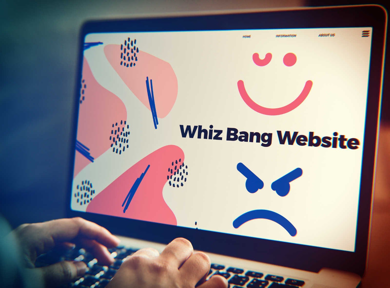
Great looking website design can be frustrating for your viewers
To me, pushing the design boundaries on your webpage and employing every whizz bang and pop offered by the most popular commercial WordPress themes may leave your viewers with a headache. If every interaction they have with your webpage is punctuated with animations, movement and actions that may be disorientating at the best, nauseating at the worst – we enter into a form over function issue.
I remember when Apple introduced the first version of OS X ( now simply called MacOs ) that was very much form over function. In addition to a new look, all interactions were punctuated with animations, swipes, squeezes and slides. For someone with years of experience using MacOs 9 and used to its instantaneous execution of tasks with no animation at all, OS X seemed slow, wasteful, inefficient and dare I say totally ‘unproductive’ for professional use. Over time Apple speeded up and economised on the animations in OSX But even today, 20 years since the shift away from MacOs 9 I have been known to use terminal commands to remove or speed up the various finder transitional animations used in Catalina, Big Sur and Monterey.
If we apply this within the context of a webpage, it’s becoming clear that making your viewer wait for an action, even if it’s a few milliseconds can become frustrating. This is even more true if multiple animations, transitions and fades one after the other compound the experience. There’s also technical base usability considerations when using animations and motion graphics on webpages too.
I would say that motion really doesn’t offer any benefit to users’ viewing your device on smart phones. Even today’s 6 inch plus 120Hz high resolution smartphone screens are no place for multiple sliding banners, fading buttons ( there’s no hover state on mobiles anyway ) or scroll based animations. On a mobile device, the majority of users will be on the move and need that information fast and with minimal fuss. Beyond delivering requested video or audio content, this is not the place to impress your viewer with webpage motion virtuosity.
Tablet and iPads arguably have more success with this due to a larger screen real-estate. This is especially true for the most recent iPads which actively try to deliver the ‘desktop’ version of your webpage to the user, not the simplified one-column ‘mobile’ experience. That said, form should follow function for business orientated websites irrespective of the device it is viewed from. Great looking web design should not come at this cost.
Impressive looking web design can be slow… Why?
How fast your website performs is based on a number of factors including how it is designed and what technologies it uses.
A few factors that can effect website performance:
Website hosting
Server response time is vitally important in delivering your content to your viewer in a timely manner. Low cost shared hosting is great for the wallet but may be costing your business lost revenue with high bounce rates due as the viewer gets fed up waiting for your website to load up and clicks off to a competitor’s website with better server response times.
No caching or poorly configured caching

Caching, either at server level or browser level can speed up webpage load times for your viewers by only loading what needs to be loaded every time they view your website. the server or browser stores or ‘caches’ elements of your webpage for use later so it does not ned to be reloaded every time.
So for business orientated ‘brochure’ style websites that don’t update content on a regular basis, this caching can make a huge difference to performance. However, poorly configured or implemented caching can actually be more detrimental to webpage load performance than having none at all. It’s important to research the various caching options open to you and follow the instructions fully when applying to your CMS.
Server based caching like Siteground’s Supercacher is a real peace of mind option as it takes away the responsibility of caching from you or your developer and provides an ‘out of the box’, ‘just works’ solution to caching and will instantly improve Time to First Byte ( TTFB) webpage loading speeds.
And finally, those design indulgent ‘bad’ choices…
Image optimisation
There’s a rogues gallery of the usual suspects that can make WordPress or any CMS run slowly. The first is the use of an image size or resolution that is far too large for web deployment. WordPress allows a developer or user to upload an image as large as 10 megabytes. Placing this on a webpage will instantly destroy your page loading speed, driving away users en-masse.
How does this happen? Well, often users will upload images directly taken from a smartphone or digital camera to a website. Often at sizes over 5000 pixels in size, they are simply far too big for website use. Ideally images that are intended to span the full length of a website page should be no more than 1920px in length.
Colour, complexity and choice of image format are also important too. Jpegs are perfect to use for photographs or images that are quite complex in colour or detail. PNGs or ‘pings’ are suitable for more graphical style images like infographics or areas that use flat areas of colour. Really it’s a suck it and see approach, but ideally you want to keep larger images below 200 kilobytes and smaller ‘editorial’ style images below 150kb ). An image right out of a modern digital camera can easily run to 30+ megabytes – that’s 30,000 kilobytes – 200 times bigger than well web-optimised 150kb image!
How do you create these web optimised images?
There’s a number of plugins for WordPress ands some for Joomla that will automatically perform optimisation for you. Smush is a popular image optimisation plugin that comes to mind for WordPress with the free tier usually offering enough scope for most websites’ needs. However, as an old-school graphic designer, I prefer to performa the optimisation myself BEFORE I upload the image to a website. Doing the optimisation yourself also allows for other choices such as cropping and colour correction.
There are many options for optimising your images yourself. Free online solutions like Compressor.io or kraken.io will allow you to resize, rename and optimise your images and prepare them for fast download on your webpage. Traditional offline desktop solutions like Photoshop or the excellent and free GIMP are big favourites too. Offering far more control over colour, cropping and resizing. however they are more complex beasts and may need more time to master.
Optimising your images well for web delivery doesn’t have to be difficult or time consuming, but it continues to be one of the most overlooked aspects of creating great looking website design.
Consider using a new image format like WebP ( from Google ). Almost 10 years old now and still a little sketchy when it comes to compatibility with all modern browsers.
But boy… does it shave off those kilobyte pounds, especially if you have to use a transparent or alpha channel ( the wheelhouse of of 24 bit pngs ). But avoid artwork with subtle gradients… 24 bit pngs still rule … just saying ;)
Animations, scrolling and motion effects
Many of the commercial themes for WordPress and Joomla showcase a multitude of options to add motion, interaction and excitement to a web page design. Although this looks impressive, behind the glitz there’s boat loads of additional code running to make this happen. jQuery, probably the most well known javascript libraries can be used to deliver this animation in realtime to your viewer.
These and similar technologies are usually well written and as efficient as possible but at the end of the day the browser has to load and execute additional code in the background to allow for this. If, on a slower system, an older browser or dog-slow internet connection this is causing the webpage to render slower or not at all we presented with the form over function dilemma again.
Mobile page speed on WordPress problem & Google Core Web Vitals

As the proportion of worldwide webpage views skew towards mobile, Google puts almost all its emphasis on the performance of your website on mobile devices. Sure, the usual suspects matter such as https, but if your website performs badly on mobile view speed tests it’s not good news and things are only going to get worse.
Historically, it’s safe to say that the big name WordPress themes have not focused on good scores for mobile. They are usually significantly worse than equivalent desktop results, throwing up ‘render blocking javascript’ or ‘unused css’ warnings in the results. Google is just stricter with these facets on mobile as it considers download time more vital and bandwidth use of mobile users critical, who may be paying for the privilege of loading your huge 5000px hero image out of their data minutes.
In May this year (2021), Google will be really pushing the boat out on mobile webpage speed and usability. Called ‘Core Web Vitals’, even more weight will be put on mobile optimisation and potentially poorly performing websites, who may currently rank well in search results could find they fall down a page or two simply because their mobile web experience is not up to google’s spec.
Moving forward, the commercial theme makers for WordPress, Joomla and other CMS can’t really ignore webpage speed and in particular how their theme deals with mobile speed and usability. It’s hard to know how much of a shake up this will create for us all. Will it be a May 2017 GDPR level of armageddon or something more subtle and progressive, gently easing website owners into making positive changes to how their website performs on mobile. Time will tell.
Philosophical dilemma of great looking website design and finding rational ways forward
Is it worth potentially losing a visitor for this extravagance? Maybe I’m being over dramatic but the cost of great web design over usability needs to be weighed up objectively. A fade here or a scroll there may not add much weight to a webpage loading but it needs to be considered and us as web developers need to avoid throwing everything but the kitchen sink on a website, just to impress our clients to seal the deal.
If you pushed it even further could it be said we are actually deceiving the client by giving them something they love at the superficial level but that ultimately won’t deliver for their business. Do we need to talk about the caveats of wanting that ‘showcase’ commercial theme demo page up front, before commissioning? Possibly, but could we be simply shooting ourselves in the proverbial professionally and losing jobs by being too transparent?
I didn’t mean for this article to become so critical of my own profession and I myself can own up to astonishing clients with heavy, overweight but beautifully impressive and immersive webpages experiences. Did I do the wrong thing? Maybe. But moving forward I find myself always asking the question ‘is this form over function?’ When a client asks why they shouldn’t have a video hero section on their homepage or scrolling animations with parallax effects abound, I take time to explain why it may not be necessary. They can then choose to agree or disagree, but the choice is given, not hidden away or assumed irrelevant.
Interaction and animation has its place. My own website, this one you are reading this article on has a variety of movement, scrolling effects and transitions. However, I’m constantly reassessing the need for such visual indulgences all the time. Checking bounce rates, looking at page speed results in Chrome Lighthouse and GTmetrix.
Today I find myself choosing commercial themes carefully, looking for examples that receive frequent updates, focus on page speed ( especially for mobile ) and offer quick and helpful support. That’s not to say that looks no longer matter to me, but it’s a balance of form and function I find myself looking for. With a slight lean to function without a doubt.
If you wound like to discuss any aspects of website design or page speed, get in touch with me and I’ll be only too happy to see if I can help out.